During hard times the difference and value emerges from the hard work. In order to raise omchain awareness and build our product on strong fundamentals, we have decided to rebrand and we have asked your opinion about rebranding and based on your decision, we have moved forward with it.
It is not easy to rebrand a product that has more than ten thousand followers & hodlers. However, it is not easy to be succesful too. Based on that, we have first rebranded our token’s name from Omlira to omChain to show that our token is not independent from the blockchain infrastructure. And to be compatible with global trends and better recognition, we have changed the token symbol from OML to OMC. Initially during the rebranding, in order to show our users that it is still us, we have utilized the existing logo of Open Money until we complete our rebranding.
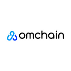
Today is the day that we have finally completed the very first step of a long journey, the very first building block of a brand & project and a token; our new logo.
“The Idea”
We have asked ourselves, “how do we show the world that what we are capable of?” because we know that our team and the community can achieve anything if we together wish and work for it. And while we are doing that, we had to be consistent with our values; hodl, buidl and grow together. Read below to hear what the lead designer at omchain, Nur Şenlikçi, thought about our design process.
It makes us happy that we have finally completed the rebranding process of our logo with all the values being represented in the design. Initially we have tried to understand what people think about omchain and how they feel about it. Our biggest concern was to be able to represent our story in the right way and for that reason the very first thing we did was to ask people about omchain and try to understand their thoughts and feelings.
With the information collected, we have sat with the team and determined our goals; unity, solidarity, growing together and rising. With those goals in our mind, we knew that our design must feel united and rising. Instead of growing inwards, it should be growing upwards. Another important point was that the logo we have should be representing the trust our community members have for us. Yes, it is important for every other brand out there too, however for us it is further important because of the philosophy of blockchain and how trust is not based on the humans but the cryptographic proofs.
We love the chain symbol as a team, and we believe that trust is not the only feeling it gives us. The figure of a chain represents growing together as more rings added to it, additionally to the trust it represents. The more rings added, the bigger and the secure the chain is. Here, the rings are actually representing the human itself and our unity.
To sum up, we know that there are many hodlers of the OMC and we are stronger when we are together, and we are aware of the fact that we will strengthen our success together. For that reason, we have designed a logo with intertwined chain rings indicating rising and we loved it.
Cryptocurrencies are not having the easiest time of their lives and many projects are battling with adoption and growth. We also share some of the concerns with the rest of the market, however, we are trusting our know-how and infrastructure. We hope that our new face represents the values we have and ideas we share. We are looking forward to sailing to success in the deep blue ocean of crypto and blockchain.
